Design DNA for PLAY brand
Stylistic line for tv and internet devices

Context
1. Play, as a leading provider of mobile services, Internet and digital TV, serves more than 17¹ million customers, constantly developing the most modern mobile network in Poland, covering nearly 100% of the Polish population.
2. The merger of Play and UPC Polska is laying the groundwork for the expansion of fiber-optic services and providing customers with a convergent service (combining internet and tv on a single invoice).
3. The introduction of the convergent offer was associated with the need to develop a consistent stylistic vision that would illustrate the company’s fresh approach to providing services in a new format and correlate with the latest trends in the electronics and interior design.
4. Play had never launched its own product before, so we are proud to have been chosen to develop the brand’s stylistic language from scratch.
Process
1. We began the work with an extensive market and use case analysis. We introduced the team to the market insights that allowed us to create concepts that broke the stylistic conventions of products present in the competitors’ offerings.
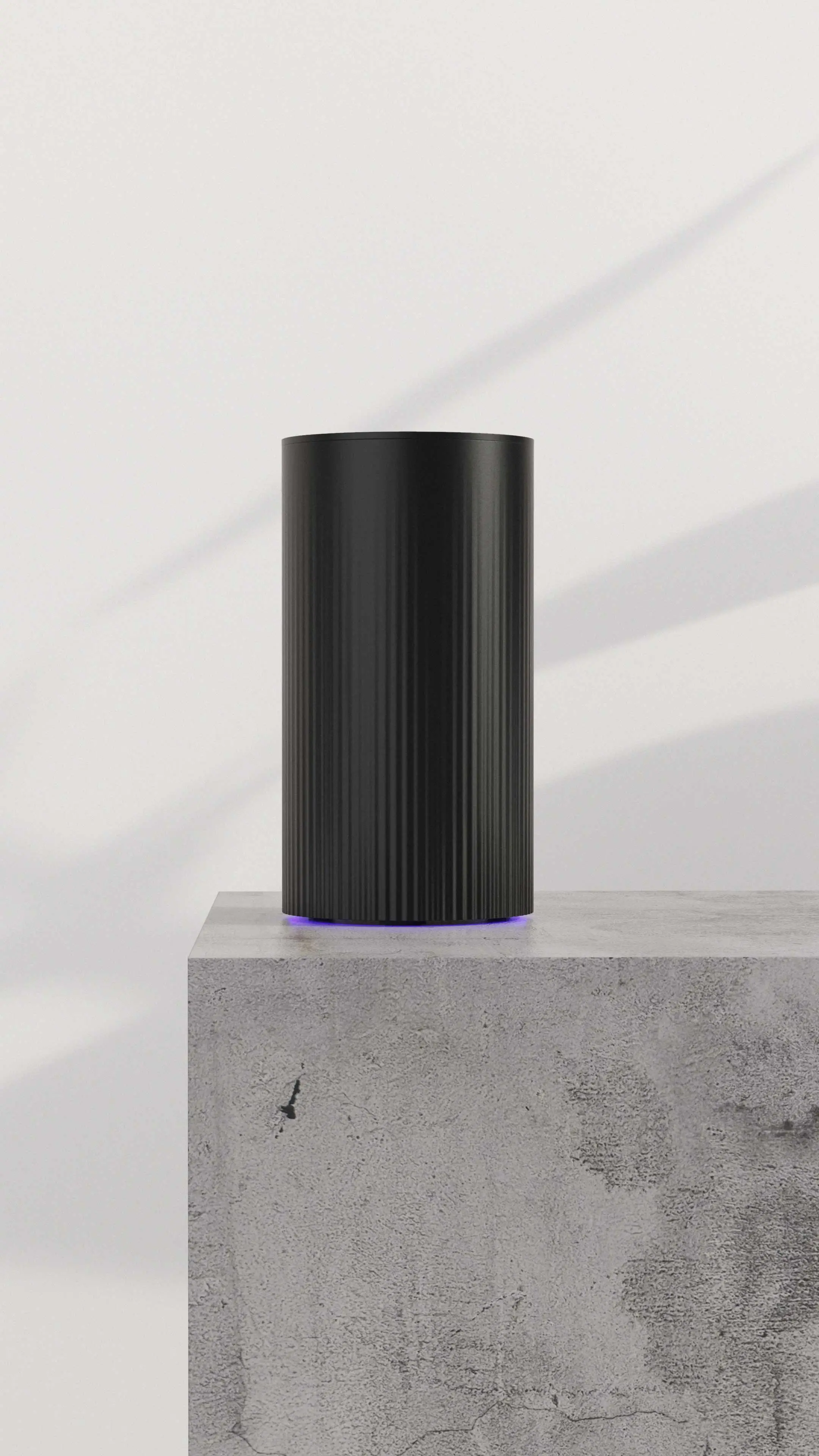
2. The stylistic proposals focused on the idea of blending into the home environment. We wanted to get away from the cumbersome elements normally associated with routers and set-top boxes: flashing LEDs, useless screens and colorful logos glaring in the eyes.
3. The design we proposed was intended to break the convention of “embarrassing” home electronics hidden in hard-to-reach nooks and crannies.
4. Aesthetic devices are more readily exposed by users. Hiding routers in cabinets exposes the devices to overheating and, as a result, shortens their lifespan and drastically reduces the range of Wi-Fi antennas.
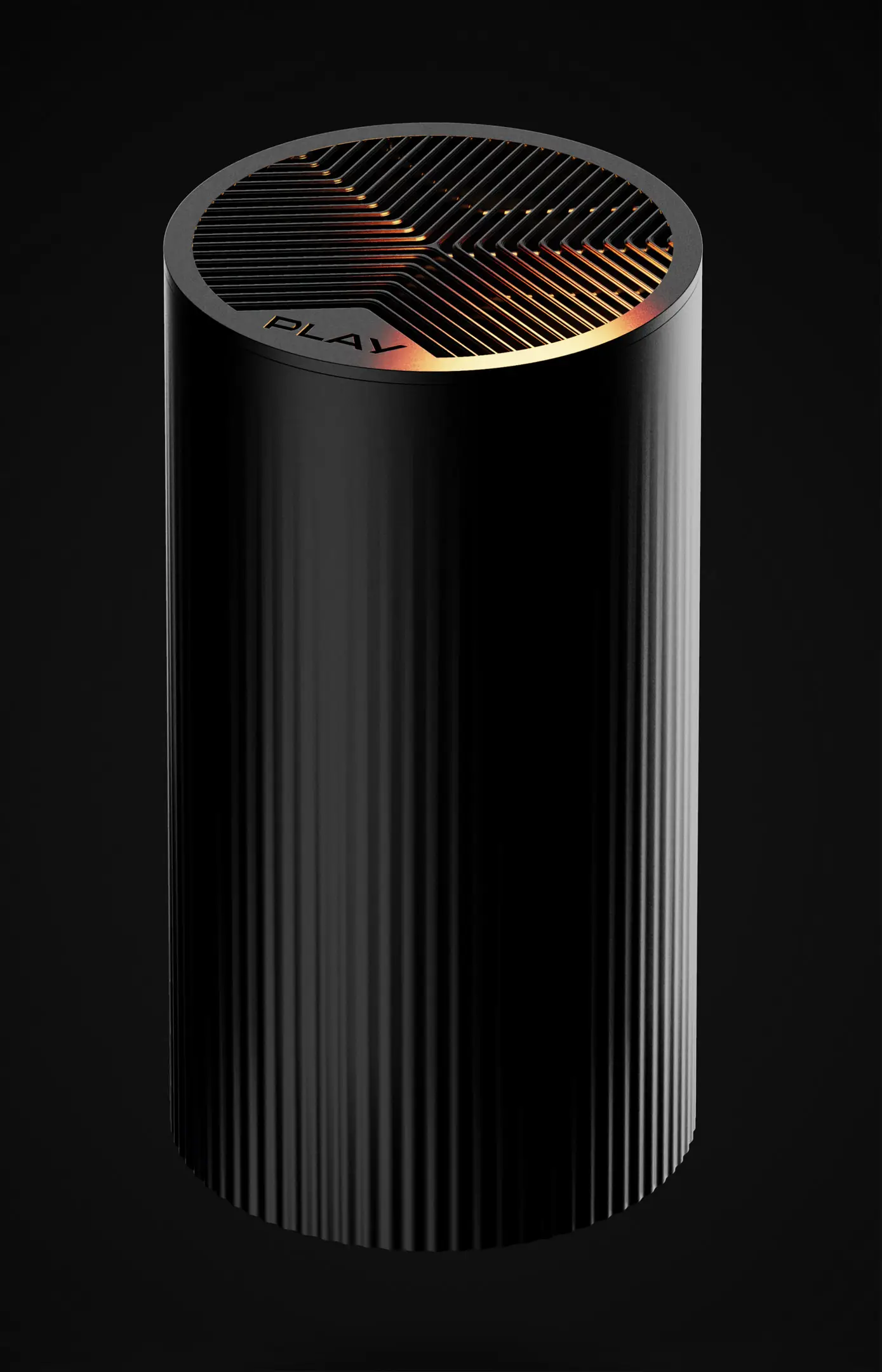
5. The stylistic line is based on simple forms with grooved surfaces, which refer to decorative elements such as vases and utility china.
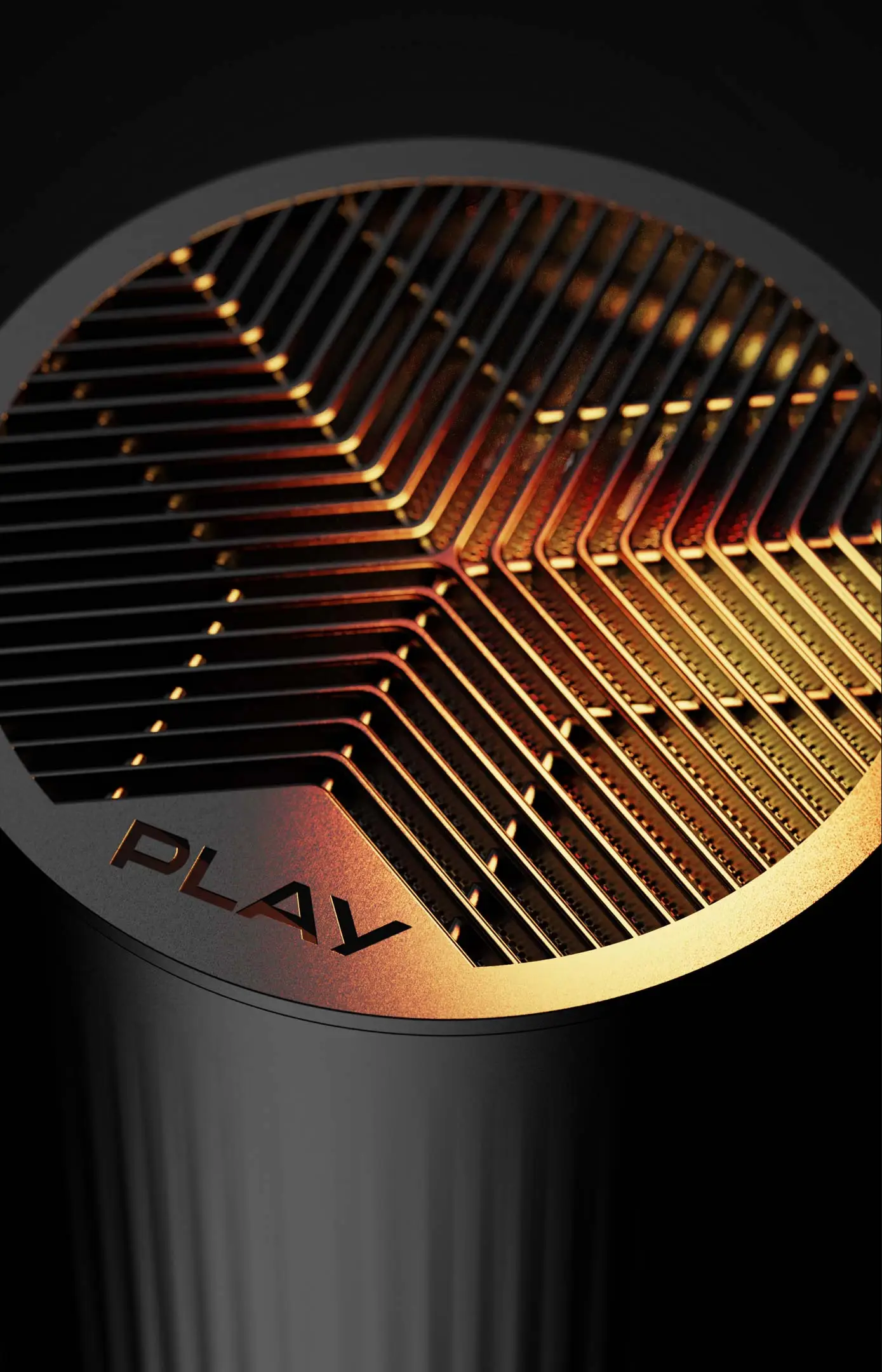
6. In the course of the work, it was crucial to ensure that the top surface of the router was optimally perforated to prevent overheating and create a recognizable character for the device.
7. We carried out the full product development process: from concept to author’s supervision over implementation.
Results
1. Our designs have already found a home in hundreds of thousands of Play customers’ apartments.
2. Strong, monolithic blocks levitate above the backlight, which is a color accent referring in a non-intrusive way to Play’s corporate identity.
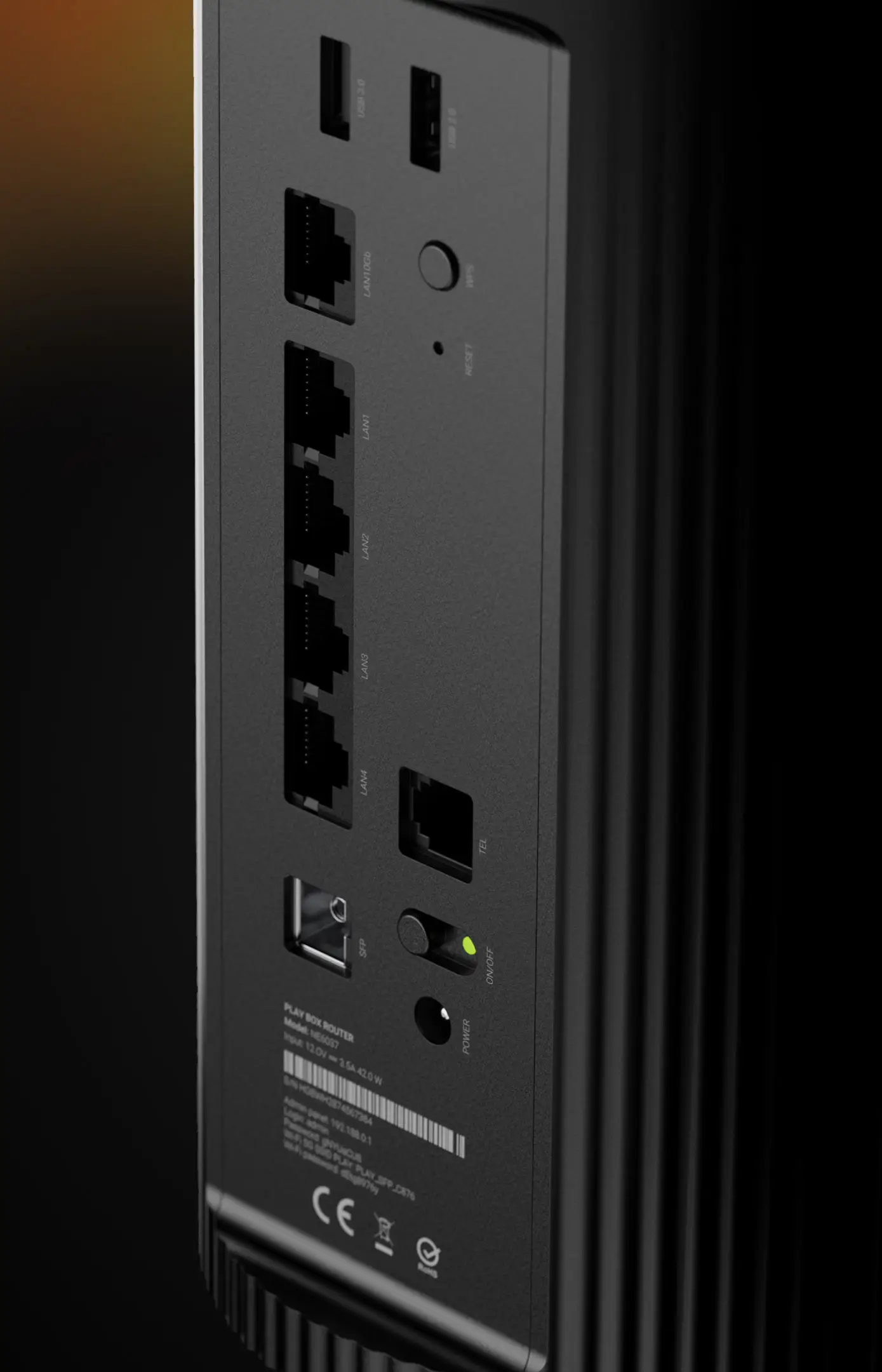
3. We managed to break the conventions of the industry by using non-intrusive monochromatic logos and hide the technical space with ports in niches on the back of the devices as far from the user’s sight as possible.
4. The stylistic language we developed is consistent for all products in terms of proportion from, color, surface, backlighting and other details.
5. The results of our work were received so well by the client that he decided to base his advertising campaign on the developed design.
6. The guidelines we developed for the brand’s design language can form the basis for the implementation for further products in the Client’s portfolio.
7. Currently, the PLAY BOX Net FTTH Router and HFC and PLAY BOX TV Decoder have been deployed on the market.


